

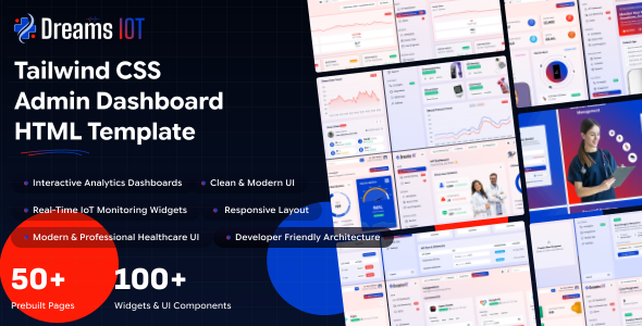
Dreams IOT is a modern, responsive enterprise administration dashboard template designed with Tailwind CSS. Streamline hospital operations, monitor patient vitals, track medical devices, manage appointments, and gain actionable insights through a modern Tailwind CSS powered IoT healthcare dashboard.
– Build with vuejs 3.5.39
– Build with Vue + Vite Config
– Create vuejs App Supported
– Hooks based architecture
– Pure Components Based vuejs
– Fully Responsive Design
– Multiple Layouts
– User friendly design
– Compatible Browsers: Firefox, Safari, Opera, Edge, Chrome
– Json format used
– Easy to Customize with css Variables
Project Overview
The project follows a modular structure with clear separation of concerns.
vue/
├── public/
│   ├── assets/
│   └── favicon.png
├── src/
│   ├── app/
│   ├── assets/
│   │	├── css
│   │   ├── icons
│   │   └── img
│   ├── components
│   ├── router
│   ├── views
│   ├── main.js
│   └── App.vue
│
├── .gitignore
├── index.html
├── jsconfig.json
├── package.json
├── package-lock.json
├── postcss.config.js
├── README.md
├── tailwind.config.js
└── vite.config.js
Structure Overview
Dreams IOT Vue uses Vue Router, lazy-loaded pages, and shared layouts to keep the app scalable and maintainable.
The app entry in src/main.js wraps routes with Provider and BrowserRouter, then mounts layout sync helpers.
Below is sample Vue app structure:
import { createApp } from 'vue'
import App from './App.vue'
import router from './router'
import Antd from "ant-design-vue";
import VueApexCharts from "vue3-apexcharts";
import Vue3Select from 'vue3-select-component'
import VueECharts from "vue-echarts";
import { use } from "echarts/core";
import { CanvasRenderer } from "echarts/renderers";
import { GaugeChart } from "echarts/charts";
import {  TooltipComponent, TitleComponent, } from "echarts/components";

const app = createApp(App)

use([
  CanvasRenderer,
  GaugeChart,
  TooltipComponent,
  TitleComponent,
]);
app.component('vue3-select', Vue3Select);
app.component("v-chart", VueECharts);
app.use(VueApexCharts);
app.use(Antd)
app.use(router).mount('#app');
Node.js and NPM :
If NodeJS is not installed then download it from https://nodejs.org/. NPM comes bundled with Node.js
Vue-cli :
Open the terminal in your root directory, By running the following command you will get a vue-cli:
npm create vue@latest NPM Packages
- Before proceding you'll need to install npm packages. You can do this by running
npm installfrom the root of your project to install all the necessary dependencies.
npm installApplication Run
- For running a project,run the command:
npm run devPlugins Install
- To install any plugins in your application, you have to run the following command
npm install plugin_nameLocal Serve
- Now you can run this Template in any web browser from your PC or Laptop.
- vuejs/template is a folder name, you can change as per your wish how you used the folder
http://localhost:3000/Build Project
- Run
npm run buildto build the project. The build artifacts will be stored in thedist/directory.
Prerequisites
Node.js and NPM :
Ensure that Node.js is installed and running on your system.
https://nodejs.org/en/download/
Package Manager
Use npm (recommended with this project lockfile) or Yarn if preferred.
npm -vVite
Vite is used as the build tool. It is installed automatically as a project dependency — no global installation required.
https://vite.dev/
Installation Steps
Extract & Navigate
After downloading, extract the Dreams IOT package and navigate to the vue directory.
Install Dependencies
npm installBefore proceding you'll need to install npm packages. You can do this by running npm install from the root of your project to install all the necessary dependencies.
Start Development Server
npm run devFor running a project,run the command
Open in Browser
Open your browser at the URL shown in the terminal (typically http://localhost:3000/)
This project uses **Tailwind CSS v4.1.13** with extensive customization Tailwind is configured to scan the following paths for class usage:
```javascript
content: [
"./src/**/*.{js,jsx,ts,tsx}",
"node_modules/flowbite-vue/**/*.{js,jsx,ts,tsx}",
"node_modules/flowbite/**/*.js"
]Plugins:
The following Tailwind plugins are integrated:
- **@tailwindcss/forms** - Better default styles for form elements
- **@tailwindcss/typography** - Beautiful typographic defaults
- **flowbite/plugin** - Flowbite component styles and utilitiesOverview
Flowbite v3.1.2** and **Flowbite Vue v0.2.2** are integrated to provide pre-built, accessible UI components.Configuration
1. Tailwind Config
Flowbite content paths and plugin are included in `tailwind.config.js`:
```javascript
content: [
  "./src/**/*.{js,jsx,ts,tsx}",
"node_modules/flowbite-vue/**/*.{js,jsx,ts,tsx}",
"node_modules/flowbite/**/*.js",
],
plugins: [
  require('flowbite/plugin')
]
```
 2. Vite Config
Flowbite is optimized for Vite bundling in `vite.config.ts`:
```javascript
optimizeDeps: {
  include: ['flowbite']
}
```
3. CSS Imports
Flowbite styles are imported in `src/main.js`:
```javascript
import 'flowbite';
import "flowbite/dist/flowbite.css";
```
Flowbite Initialization System
FlowbiteProvider
A custom provider (`src/app.vue`) ensures Flowbite components are initialized:
- Initializes on component mount
- Re-initializes on route changes
- Handles dynamic content rendering


import { initFlowbite } from "flowbite";

```
#### FlowbiteInitializer
Global initializer in `src/app.vue` that:
- Runs on app startup
- Performs multiple initialization passes to ensure all components are ready
- Handles timing issues with dynamic content

onMounted(() => {
  initFlowbite();

  document.querySelectorAll(".dropdown-toggle").forEach((dropdownToggle) => {
    dropdownToggle.addEventListener("click", function (e) {
      e.preventDefault();
      const dropdownMenu = this.nextElementSibling;
      dropdownMenu.classList.toggle("hidden");
    });
  });
});

**Features**:
- `initializeFlowbite()`: Initialize Flowbite components
- `reinitializeFlowbite()`: Reinitialize with delay for DOM updates
- `useDataTableFlowbite()`: Specialized hook for data tables with dynamic content

### Flowbite Components Used
The project extensively uses Flowbite components including:
- **Modals**: Dynamic modals in data tables and forms
- **Dropdowns**: Navigation and action menus
- **Tooltips**: Contextual help
- **Offcanvas**: Side panels and drawers
- **Tabs**: Content organization
- **Accordions**: Collapsible content sections

### Usage Example
```javascript
// Using Flowbite modal with dynamic initialization
import { initFlowbite } from "flowbite";

const MyComponent = () => {
  onMounted(() => {
      initFlowbite();
    });
}
You can change the logo in your Vue project by following these steps:
- Replace the Logo Image:
- Place your new logo image (e.g.,
logo.svgorlogo.png) in thesrc/assets/img/logo/folder.
- Place your new logo image (e.g.,
- Update the Logo Import in Your Component:
- Open the Vue component where the logo is used (commonly
src/components/Header.tsx,Navbar.tsx, or similar). - Update the import statement to use your new logo file. For example:
import logo from '../assets/img/logo/logo.svg'; - Open the Vue component where the logo is used (commonly
- Update the Logo Usage in JSX:
- Replace the
<img>tag'ssrcattribute to use the imported logo variable:
{``} - Replace the
- Save and View Changes:
- Save the file and check your app in the browser. The new logo should appear in place of the old one.
- You can use
.svg,.png, or.jpgfiles for your logo. - For best results, use an optimized SVG for scalability and crispness.
The default font is Google Sans Flex. To change the font:
Update the @import URL and the --font-family-primary variable in src/style/css/style.css:
@import url('https://fonts.googleapis.com/css2?family=Google+Sans+Flex:opsz,wght@6..144,1..1000&display=swap');

@theme {
  --font-family-primary: "Google Sans Flex", sans-serif;
}The design token variables are defined in the @theme block of src/style/css/style.css. Here are the primary color tokens:
--color-primary: #023DC9;
--color-secondary: #FE1C06;
--color-dark: #020610;
--color-white: #FFFFFF;
--color-light: #F0F4F8;

--color-success: #10B981;
--color-warning: #F59E0B;
--color-danger: #EF4444;
--color-info: #0EA5E9;
Each of primary, secondary, success, warning, danger, info, purple, gray, light, pink, orange, cyan, indigo and teal also ship a full shade scale (100–900 plus a -hover/-transparent variant), e.g. --color-primary-100 through --color-primary-900 and --color-primary-hover. Semantic tokens for the sidebar (--sidebar-bg, --sidebar-menu-item) and topbar (--topbar-bg, --topbar-item) are also defined in the same block.
Background Color Change
You can change the header background color in style.css as per your wish
.navbar-header {
	@apply bg-(--topbar-bg)
}How it Works
Dark mode state is managed in Redux and persisted to localStorage. A sync component writes the current theme to a data-theme attribute on the <html> element, which a Tailwind custom variant reads to apply dark: utility classes.
src/redux/themeSlice.ts holds a darkMode boolean, initialized from localStorage and toggled via toggleTheme() / setTheme(bool):
const initialState = {
  darkMode: getStoredString("theme") === "dark",
};
// toggleTheme() / setTheme(bool) update state and localStorage
src/layout/DocumentStateSync.tsx is the single bridge that writes the attribute to the DOM whenever the Redux state changes:
document.documentElement.setAttribute("data-theme", darkMode ? "dark" : "light");In src/style/css/style.css, a custom Tailwind variant reacts to that attribute so any dark: utility applies automatically:
@custom-variant dark (&:where([data-theme="dark"], [data-theme="dark"] *));

/* usage example */
body { @apply dark:bg-none dark:bg-[#1A1A1A]; }To enable Right-to-Left (RTL) layout, add the dir="rtl" attribute to the <html> tag:
<html lang="ar" dir="rtl">Tailwind CSS handles RTL layout transformations automatically when the dir attribute is set. All margin, padding, and positioning utilities adapt to the RTL direction.
RTL Demo
An RTL demo page is available at rtl.tsx in the HTML version for reference.
The default layout features a full vertical sidebar on the left, a horizontal topbar at the top, and the main content area. This is the standard layout used across all dashboard pages.
- Full-width sidebar with navigation menu, logo, and user profile
- Top header with search, notifications, and user actions
- Responsive - sidebar collapses to overlay on mobile devices
The mini sidebar layout collapses the sidebar to show only icons, providing more space for the main content area. Users can toggle between expanded and collapsed states using the sidebar toggle button.
- Collapsed sidebar showing only menu icons
- Hover to expand and reveal full menu text
- Toggle via the hamburger button in the topbar
Dreams IOT is developed by Dreams Technologies and is available under both Envato Extended & Regular License options.
Regular License
Usage by either yourself or a single client is permitted for a single end product, provided that end users are not subject to any charges.
Extended License
For use by you or one client in a single end product for which end users may be charged.
What are the main differences between the Regular License and the Extended License?
If you operate as a freelancer or agency, you have the option to acquire the Extended License, which permits you to utilize the item across multiple projects on behalf of your clients.
| NAME | URL |
|---|---|
| Bootstrap | https://getbootstrap.com/docs/ |
| Bootstrap-vue-3 | https://www.npmjs.com/package/bootstrap-vue-3 |
| Fontawesome | https://www.npmjs.com/package/@fortawesome/fontawesome-free/ |
| Fullcalendar | https://www.npmjs.com/package/fullcalendar |
| Vue3-apexcharts | https://www.npmjs.com/package/vue3-apexcharts |
| Vue3-perfect-scrollbar | https://www.npmjs.com/package/vue3-perfect-scrollbar |
| Vue Date | https://www.npmjs.com/package/vue3-datepicker |
| Vue3-select2-component | https://www.npmjs.com/package/vue3-select2-component |
| TinyMCE Editior | https://www.tiny.cloud/solutions/wysiwyg-vue-rich-text-editor |
Need Support?
If this documentation does not address your questions, please feel free to contact us via email at support@dreamstechnologies.com
Reach the team at GMT+5:30. Typical reply within 12–24 hours on weekdays — rarely up to 48 hrs during holidays. Support is available to verified buyers for template-related issues.
Contact SupportImportant Note : We strive to offer top-notch support, but it's only available to verified buyers and for template-related issues such as bugs and errors. Custom changes and third-party module setups are not covered.
Do you need a customized application for your business?
If you need a customized application for your business depends on your specific requirements and goals, Please contact us. Customization can be the key to success, ensuring your project perfectly aligns with your unique goals and requirements.
Don't Miss Out on the Benefits of Customization!
Unlock the potential of your project. It's time to ensure your project isn't another cookie-cutter solution but truly unique and effective one.
Discover how customization can make a difference in your project's success. Let's create a solution that's as unique as your vision!
We'll tailor the application to meet your specific needs and preferences.
We will upload your website to the server and ensure it is live.

Thank You
Thank you once again for downloading Dreams IOT.
We hope you're enjoying your experience, and we kindly request that you take a
moment to share your valuable review and rating with us.